I included my contact details in the description box.
Link to YouTube Showreel
Showing posts with label LAUAN402. Show all posts
Showing posts with label LAUAN402. Show all posts
Wednesday, 1 May 2019
Sunday, 31 March 2019
Study Task 9 - Who's who? What do they do and who do they work for?
Nick Kondo is a Senior Animator at Sony Pictures Imageworks. I discovered his work through Twitter after I watched 'Spider-Man: Into the Spider-Verse' as he released several behind the scenes videos and concept art from the film after it's release. I particularly liked a short clip he posted from his demo reel where we can potentially see an early influence of Spider-Ham's run cycle.

Next year I wish to experiment more animating in 3D.
British concept artist and animator Carol Wyatt worked on the children's television show 'Fosters Home for Imaginary Friends'. She provided the artwork for the backgrounds, including the exterior of the main house. She has since worked on shows such as 'Rick and Morty' and 'Over the Garden Wall'.

Over the past few months, I've noticed that I have an interest in background design. Carol Wyatt's work is incredibly inspiring as at the moment, the backgrounds I am producing seem to be rather unimaginative; as if I am still trying to make them look too realistic. I feel Wyatt's work is able to perfectly portray a realistic environment whilst still exploring creative and cartoon-esque themes due to her use of colour, shape, and her ability to manipulate perspective.
Yaoyao Ma Van As is an art director and illustrator who also worked on some of the backgrounds for season two of 'Rick and Morty'. She has also worked for Disney and Warner Brothers, and works as a freelance artist.

As well as colour, something that stood out to me while looking through this practitioner's portfolio was how much she paid attention to detail. Each piece is extremely meticulous and as a perfectionist, this level of detail is something I hope to include in my own work next year.
Nicolas Weis is a French visual development artist, who has worked for Dreamworks, Paramount and Imagi. I first came across his work while looking at concept art for the 'How to Train your Dragon' franchise. He also worked on 'The Croods' and 'Astroboy'.
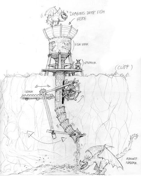
I appreciate how functional his designs are as he often labels them or adds certain characters to demonstrate scale or weight. Next year we will be producing work in teams which means we have to be as communicative and helpful as possible. I aim to work so that my concept art speaks for me and therefore the team will know exactly what is going on, rather than creating several pieces of conflicting designs.
Kieran Belshaw is a visual effects and concept artist based in London, who has worked for HBO. His concept artwork for 'Game of Thrones' is something that interested me as similarly to the previous artists I have mentioned, his work is incredibly detailed and in most cases, translated perfectly into the show. He previously worked on films such as 'The Man from U.N.C.L.E.', 'Dredd' and 'Allied'.

Before coming to university, 3D CGI and visual effects were an area of animation that interested me as I thought the idea of combining live action footage with animated visuals in order to realistically bring fantasy or science fiction to life is something I wished to achieve. I haven't explored this area much in my first year so hopefully next year, I can experiment more with visual effects.
Cam Sykes is another freelance illustrator and concept artist, who specialises in environment and character design. He has a YouTube channel where he uploads tutorials (which is how I discovered him) and is currently based in Sydney.

I like how much of a variety his videos offer and I hope to pick up some tips and tricks for when I design my own settings and characters next year.
Friday, 29 March 2019
Studio Brief 3 - Evaluation
For this studio brief, we were tasked with presenting a summary of our first year at university, as well as our first ever show reel. After seeing a few examples in class, I aimed to produce around twenty slides describing my time in and out of university over this year so far. The presentation had to be under fifteen minutes long.
Link to Evaluation
Below is my script although during the actual presentation, I felt more relaxed as the environment felt less formal than the previous presentations so I didn't stick to the script as strictly as I thought I would. I feel because of this, my demeanour was more welcoming and therefore my presentation may have been better received than my first attempt. People laughed when they were supposed to and I felt I engaged with the audience well by adding humour to the slides that covered more serious topics.
Link to Speech
Overall, the presentation lasted just over thirteen minutes. Below is my show reel. I hope to continue to practice using the new software I've learned over summer so I can update my show reel over time.
Link to Showreel
Sunday, 3 February 2019
Disseminate (Presentation for Studio Brief 2)
BraveStarr Presentation
Link to BraveStarr Powerpoint Presentation
Practicing my Presentation
To make sure the speech fit within the time limit, I recorded myself several times rehearsing it so I knew how to develop it into a more sufficient script.
In the video above, which lasts five minutes and twenty-nine seconds, I felt certain slides were dragging so I decided to shorten my speech as to not lose the attention of my audience.
I managed to shave off about a minute from my original script which means now I am more likely to finish the presentation within the five minute cut-off length (I gave myself twenty seconds spare in case of any mistakes). I will continue to rehearse the presentation until I am confident with it.
My (Edited Script)
Today I will be delivering a presentation on the animated series: BraveStarr.
BraveStarr was produced by Filmation from 1987 to 1988. It was the last animated series the company produced before it shut down a year later. However, this doesn't reflect the show's success! According to Lou Scheimer who was one of the original founders of the company, he considered BraveStarr to be Filmation's crowning achievement.
Scheimer founded Filmation with Hal Sutherland and Norm Prescott in 1962, and together, they produced shows and films up until 1989. Some of their shows include: He-Man, She-Ra, Ghostbusters, Flash Gordon, and more.
The animation technique used in BraveStarr was painted, 2D cel animation. Cels are transparent sheets which the characters are painted on top of. Most of the footage was rotoscoped, which is a technique involving tracing over live action footage.
Filmation wanted to remain based in the US, so this meant certain rotoscoped footage had to be reused due to financial issues. Yet, because the cels were never shipped across seas, the finished outcome was much cleaner than most animations that came out in the same time period.
Personally after watching the show, I didn't notice the clips that had been reused. The only things that stood out to me were that occasionally, the characters would go off model, or some shots seemed a little jerky. However I genuinely like the appeal of the characters and for the most part, the animation was very smooth.
So, what's the main message to take away from each episode? Every episode would have a moral lesson for the audience to learn from. While this is a children's show, the series does explore more controversial themes which means adults can also take away important messages. Overall, the episodes were rather formulaic. There would be a problem presented at the start which the heroes would have to resolve by the end.
The series is set in the future, on a planet called New Texas. It combines both western and science fiction genres which at the time, was original. In the opening sequence, the setting and story is explained so that newcomers could easily pick up the concept.
Marshall BraveStarr is the main protagonist of the series. He is a superhuman, Native American cowboy who possesses the power of four spirit animals which he calls upon in each episode to fight off outlaws and aliens. It was important to Scheimer to spotlight a Native American hero as other animated series at the time mainly centred around white protagonists.
Out of all the shows Filmation produced, BraveStarr is arguably the most relatable character as he isn't the stereotypical macho hero, but instead, more human. He exhibits emotions and this was progressive at the time as it showed kids there was more to being a hero than just physical strength.
Thirty/Thirty is BraveStarr's quick-tempered sidekick. He is an Equestroid which is a creature who is half horse and half cybrog. The design is loosely based on David Lee Roth from Van Halen which was interesting to me as out of the four main characters in the series, Thirty/Thirty is the only one based on a white man. I thought this was also progressive as usually, it's a member of a minority group that would fall under the role of "sidekick".
Judge J.B. McBride is BraveStarr's love interest and she was designed by female animator, Diane A. Keener. While her relationship with BraveStarr is an important factor of this character, it isn't her only purpose. She is also able to hold her own in dangerous situations, proving to be just as heroic as the other protagonists, rather than the stereotypical damsel in distress. In one of the first episodes I watched titled "The Witnesses", when BraveStarr orders her to take cover, she replies "Cover? Don't be silly!" and engages in the fight.
Shaman is another Native American lead with supernatural powers. He is BraveStarr's mentor and an important part of his backstory.
The depiction of Shaman wasn't considered offensive or distasteful. His character and design were both treated with respect. The show came out over thirty years ago, and I don't believe there were any ill intentions behind this character's design. However, recently there has been controversy surrounding cartoons such as the Simpsons which came out only a year after BraveStarr had ended. At the time, people didn't raise concerns about characters such as Apu but now, people find the depiction to be racist so, if BraveStarr came out today, would these characters also be considered racist stereotypes?
As well as featuring Native American and female leads, something else that made the show more original and memorable are the topics certain episodes are focused on. One episode titled "The Price" covers topics as dark as drug addiction and actually results in the death of a young character.
Bearing that last slide in mind, believe it or not the show was aimed at children!
Thanks for listening!
Friday, 11 January 2019
Study Task 8 - Competition
- Leeds Young People's Film Festival
This festival provides feedback to all participants, and the event has masterclasses and workshops. There is a £250 prize for winners.
- Anim18
The animation challenge provides an animation pack with set challenges and activities that you are able to share on social media.
- LoopdeLoop
This is an international online animation challenge with monthly briefs.
- Canterbury Anifest
An annual animation festival with both film, and character design competitions. As well as screenings, there are also masterclasses, workshops and talks.
- Encounters
This is a short film and animation festival that takes place in Bristol. There are several events running throughout the festival.
- Filminute
This is a one minute film festival with a specific animation category. It is international.
- Cork Film Festival
This film festival is an annual, ten-day-long festival which looks at a variety of films, including an animation category. It accepts local, national and international entries.
- AniJam
Annually, AniJam releases a challenge that in forty-eight hours, teams have to complete an animation based around a specific brief.
Sunday, 6 January 2019
Study Task 7 - Stop, Look and Listen
I think using humour whilst discussing certain information makes the audience more eager to watch as it keeps them entertained as well as informed. The nostalgic art style and soundtrack also help to engage the audience. (Finland 2015)
The characters' appeal in this animation works well in attracting the right audience, as the wholesome and cute style, and bright colours, will more likely attract a younger audience. The narrator is also an important factor in creating PSAs for children. (United Kingdom 2015)
This advert works well as it takes a familiar story most people would have been brought up on and turns it into something much harsher, from a childhood fantasy into a darker, realistic example of what it must feel like for little girls who are asked the same questions. (Canada 2002)
I thought this was a really clever animation and once more, the use of comedy is what differentiates this PSA to a strictly factual one as this is more likely to remain in my head. (France 2016)
I have a short attention span so admittedly, when I have travelled before on an airplane, the safety videos usually go over my head. If Taika Waititi cosplaying Gandalf turned up on a flying eagle however, I definitely would have paid attention! (New Zealand 2014)
I also included a more serious PSA to show how for more critical and weighty subjects, comedy isn't always going to work and by looking at it more realistically, this has a better impact on the audience. (China 2015)
This PSA is one I had already seen due to my little brother owning the app on his phone which was produced after this was so successful. This video became viral and because of this, was able to reach millions of people around the world. (Australia 2012)
To promote Sausage Party, this parody was created. While this isn't to be taken seriously, the traits often found in PSAs are all here which means this was successful to be recognised as such. (USA 2016)
This example is very poignant and moving, as although I can't understand the language, the message can still be understood despite this because what the video represents is a universal struggle and something we can all understand. (Bangladesh 2013)
I like the characters' appeal in this animation and how the message isn't forced or explicit but more subtle and realistic as whilst the character's designs may be more imaginative, we can still relate to what is happening as we have most likely been in similar situations. (Nova Scotia 2016)
Sunday, 30 December 2018
Study Task 6 - Non Fiction Animation
The style of animation in this trailer stood out to me as I appreciate how you can feel the weight behind each stroke. I feel this adds another layer to the story they are documenting as the outline seems more genuine and personal, as though someone has inked each frame as apposed to a cleaner style. (Israel 2008)
This documentary is very personal and emotional. I believe the use of sound and the use of shapes, particularly at the beginning, set the atmosphere of the animation, as well as the muted blue tones seen throughout. (Sweden 2014)
I believe discussing topics that are considered taboo in a more light-hearted and humorous manner is a tactical way of shedding a light on more controversial subjects. The use of sound and visuals in this documentary I feel makes the viewer more willing to listen to the message. (Canada 2016)
I like the use of mixed media in this documentary as it proves that you can tell a story multiple ways. (Palestine/ France/ Canada 2014)
I like the visuals in this animation and the catchy jingle they sing throughout leaves a memorable impression in the audience's head. (USA 2017)
I feel if the animation style was too abstract, the audience wouldn't be able to connect very strongly to the history and if the documentary had been filmed using real life actors, the producers may have been forced to shy away from the more gruesome details of the accounts. So, by using a semi-realistic style within animation, they could not only portray the horrific accounts in detail however could also still evoke that emotional response from the audience as we can recognise the people behind the art. (New Zealand 2015)
I feel the use of colour (particularly the harsh red and deep blue) sets the tone of this animation and is able to further demonstrate the message within the story. (England/ China 2016)
The visuals in this documentary help the audience to ask the same questions being presented to them. (France 2013)
I believe the way in which this metaphor is presented in this documentary adds almost a fictitious element to this person's account which may entice a larger audience as it raises certain questions and gives the documentary more of it's own identity. (Germany 2014)
I like the limited colour palette in the animated sections and muted colours used throughout. This style of animation is also something that caught my attention. (Japan 2016)
Monday, 3 December 2018
Study Task 5 - The Power to Persuade
I remember seeing this advert on Facebook years ago after it went viral, and I've never forgotten it. The fact this advert is so memorable and unique even after so many years proves how successful this marketing campaign was. (France)
The visuals in this advertisement are absolutely stunning, and the narrative that is told by the racer's internal monologue evokes a very emotional and universal sense of patriotism. (Brazil)
I believe this ad campaign is incredibly successful in demonstrating it's message as it uses humour to attract the right audience it's hoping to reach. The character's designs are also very appealing. (Russia)
This advert stood out to me as I like the use of mixed media. (Canada)
I believe the use of sound to demonstrate the speed and purpose of the product works well in this advert. However, the visuals aren't that captivating so if I were to see this on the television, it wouldn't be that memorable. (Germany)
The timing in this animation is so smooth and the lighting and direction helps to capture the mood of the advert. The message is very influential due to the harsh cut and music chosen. (England)
I find adverts that are able to tell a story, no matter how short, will always be memorable and heart-warming. (Australia)
This is another advert I saw years ago after going viral on YouTube. The use of props and humour makes this a funny, memorable advert, and despite coming out years ago, I still quote it from time to time which means the advert has done it's job well and is very persuasive. (America)
This advert is very strange and funny, and I feel would work well if the target audience were children as the humour may be lost on a more mature audience. (Japan)
Out of all the adverts I watched, I found this one to be the least striking. I believe the story is unoriginal and I find the use of sound to be rather tedious. (India)
Sunday, 18 November 2018
Study Task 4 - Let Me Entertain You!
Twelve Animations (from Twelve Countries)
1) Amaro and Walden's Joyride - The Line (GB 2015)
Before I visited MAF, I discovered this clip on YouTube and chose to include it as I felt the animator gave great consideration to every aspect of the character's appeal. While at MAF, The Line presented a Masterclass covering their previous commissions and having seen their various techniques, this only made me more interested in this style of animation.
2) Afternoon Class - Seoro Oh (South Korea 2015)
Sound in this clip is utilised effectively to further connect to the audience's emotions as they follow the relatable narrative before them. The metaphorical visuals work incredibly well alongside the sound in this 2D digital animation. Considering the aesthetic, the colour stood out to me in this clip.
3) Scrambled - Polder Animation (Netherlands 2017)
This film is slightly longer than the first two however I feel the length is exactly right to tell the narrative without losing the interest of the audience, which I found a few other animations were guilty of.
4) Raymonde or the Vertical Escape - Sarah Van Den Boom (France 2018)
At MAF, I was introduced to this animation. I thought the story was thought-provoking and emotional, and the concept left the audience with a certain impression that was unique to the film and couldn't be replicated.
5) Who's Hungry? - David Ochs (US 2009)
The use of sound in this animation I believe helps capture the horror the story tells of; particularly the screeches of the kidnapper and the whirring of the blender. The lack of colour and sketchy, pencil-drawn style I find also evokes a more melancholy and uneasy vibe to the clip. The length also works well in leaving the audience apprehensive of what is about to happen, yet is also not too drawn out that they lose interest.
6) Animal Behaviour - Alison Snowden and David Fine (Canada 2018)
The voice acting in this clip and behavioural stereotypes based on the animals I feel made the animation much more wholesome even though the basic concept is a little more cynical masked with humour.
7) Wildebeest - Nicholas Keppens and Matthias Phlips (Belgium 2017)
I found the tone of this animation to be rather dark despite the fact there is humour running throughout. I thought this juxtaposition worked well in order to invoke a certain, unique response from the audience, which left questions in their minds.
8) Squaring the Circle - Karolina Specht (Poland 2018)
The use of abstract metaphors in this animation I felt provided something unique and fresh to the media.
9) One Small Step - Taiko (US/China 2018)
Similarly to the first clip, I felt the characters' designs were incredibly captivating and likeable.
10) The Fox - Sadegh Javadi Nikjeh (Iran 2018)

At MAF, I watched this animation. I thought the story was poignant and riveting. Aesthetically, the design (particularly the background) I believe adds another layer to the overall message by capturing a particular tone.
Link to the Fox Trailer
11) The Fly - Ferenc Rofusz (Hungary 1980)
I chose this clip as it uses a different technique to the others and also is much older so I can see the variation in animation and how it has evolved as time has gone on.
12) Death of a Father - Somnath Pal (India 2017)
This animation evoked an incredibly strong emotional response from not just myself, but most of the audience it reached as the focus of the film is something most people will experience in their lifetimes. The artistic design reminded me of old Pop Art pieces.
1) Amaro and Walden's Joyride - The Line (GB 2015)
Before I visited MAF, I discovered this clip on YouTube and chose to include it as I felt the animator gave great consideration to every aspect of the character's appeal. While at MAF, The Line presented a Masterclass covering their previous commissions and having seen their various techniques, this only made me more interested in this style of animation.
2) Afternoon Class - Seoro Oh (South Korea 2015)
Sound in this clip is utilised effectively to further connect to the audience's emotions as they follow the relatable narrative before them. The metaphorical visuals work incredibly well alongside the sound in this 2D digital animation. Considering the aesthetic, the colour stood out to me in this clip.
3) Scrambled - Polder Animation (Netherlands 2017)
This film is slightly longer than the first two however I feel the length is exactly right to tell the narrative without losing the interest of the audience, which I found a few other animations were guilty of.
4) Raymonde or the Vertical Escape - Sarah Van Den Boom (France 2018)
At MAF, I was introduced to this animation. I thought the story was thought-provoking and emotional, and the concept left the audience with a certain impression that was unique to the film and couldn't be replicated.
5) Who's Hungry? - David Ochs (US 2009)
The use of sound in this animation I believe helps capture the horror the story tells of; particularly the screeches of the kidnapper and the whirring of the blender. The lack of colour and sketchy, pencil-drawn style I find also evokes a more melancholy and uneasy vibe to the clip. The length also works well in leaving the audience apprehensive of what is about to happen, yet is also not too drawn out that they lose interest.
6) Animal Behaviour - Alison Snowden and David Fine (Canada 2018)
The voice acting in this clip and behavioural stereotypes based on the animals I feel made the animation much more wholesome even though the basic concept is a little more cynical masked with humour.
7) Wildebeest - Nicholas Keppens and Matthias Phlips (Belgium 2017)
I found the tone of this animation to be rather dark despite the fact there is humour running throughout. I thought this juxtaposition worked well in order to invoke a certain, unique response from the audience, which left questions in their minds.
8) Squaring the Circle - Karolina Specht (Poland 2018)
The use of abstract metaphors in this animation I felt provided something unique and fresh to the media.
9) One Small Step - Taiko (US/China 2018)
Similarly to the first clip, I felt the characters' designs were incredibly captivating and likeable.
10) The Fox - Sadegh Javadi Nikjeh (Iran 2018)

Link to the Fox Trailer
11) The Fly - Ferenc Rofusz (Hungary 1980)
I chose this clip as it uses a different technique to the others and also is much older so I can see the variation in animation and how it has evolved as time has gone on.
12) Death of a Father - Somnath Pal (India 2017)
This animation evoked an incredibly strong emotional response from not just myself, but most of the audience it reached as the focus of the film is something most people will experience in their lifetimes. The artistic design reminded me of old Pop Art pieces.
Saturday, 17 November 2018
Study Task 3 - Research
10 Online Sources
5 Print Based Magazines/ Journals
5 Books
3 Places
- On Animation
- AWN
- Skwigly
- Animation Studies 2.0
- Cartoon Brew
- Short of the Week
- YouTube
- The Line Animation
- 3D Total
- Slurpy Animation Studios
5 Print Based Magazines/ Journals
- Animation Magazine
- A General Aesthetics of American Animation Sound Design - Paul Taberham
- Fudge Animation Journal
- 3D World Magazine
- Wild Cartoon Kingdom Magazine
5 Books
- Animation: The Global History - Maureen Furniss
- The Animator's Survival Kit - Richard E. Williams
- Animated Performance: Bringing Imaginary Animal, Human and Fantasy Characters to Life - Nancy Beiman
- Animation: A World History - Giannalberto Bendazzi
- The World History of Animation - Stephen Cavalier
3 Places
- The National Science and Media Museum
- The Manchester Animation Festival
- Birmingham MCM Comic Con
Monday, 29 October 2018
Study Task 2 - Who Am I?
Who Am I?
Why you chose to study on this course?
- given the opportunity to use professional equipment and software I wouldn't normally have access to
- expand my practice (by exploring new techniques I wouldn't have considered)
- meet others who share a passion for animation and exchange valuable criticism to further my own development
- through university, attend competitions/festivals which builds connections to larger companies
- gain plenty of experience which helps to build a strong portfolio so I can find a job
What do you want to learn during your time on the course?
- 3D CGI animation (combining animation with live action)
- 2D digital animation (developing my cartoonistic style)
- how to use software such as Photoshop and more advanced industry level programmes
- build a professional portfolio and experience of what it's like to work with a team of animators to a strict deadline
- transferable job skills (such as interview techniques and time management)
What skills do you think are your strengths?
- painting/ rendering detailed characters with correct colouring and precise marks
- effectively sketch characters from my head and accurately portray my inner vision
- motivated and disciplined when it comes to getting work finished
- from observation, I believe my proportions are accurate and correct
- blogging consistently
What things that you want to improve?
- puppetry and stop motion animation (as I need to gain experience in this area)
- taking more of a back seat when working in a team (as I can be quite controlling if I'm not challenged)
- my Photoshop abilities
- manage my time more effectively to avoid unnecessary panic or stress
- writing more concisely and to the point instead of rambling
What ways you will evaluate your progress?
- posting weekly blog updates reflecting on my work
- group critique sessions to get my peers' feedback
- critically analysing my own work through regular evaluations
- booking one to one sessions with my tutors
- challenging my ideas by suggesting alternative interpretations
Subscribe to:
Posts (Atom)